Checkout UX: twelve details payers notice first
Small interface choices that reduce drop-off before the bank app opens.
Most shoppers decide whether to trust a payment step in a few seconds—before they ever open a banking app. When the rail is bank-to-bank (QR, redirect, or “pay in app”), the checkout screen is doing two jobs at once: explain what will happen next, and remove reasons to hesitate.
Skim-first rule: if someone only reads headings and pull quotes, they should still leave with a checklist they can apply today.
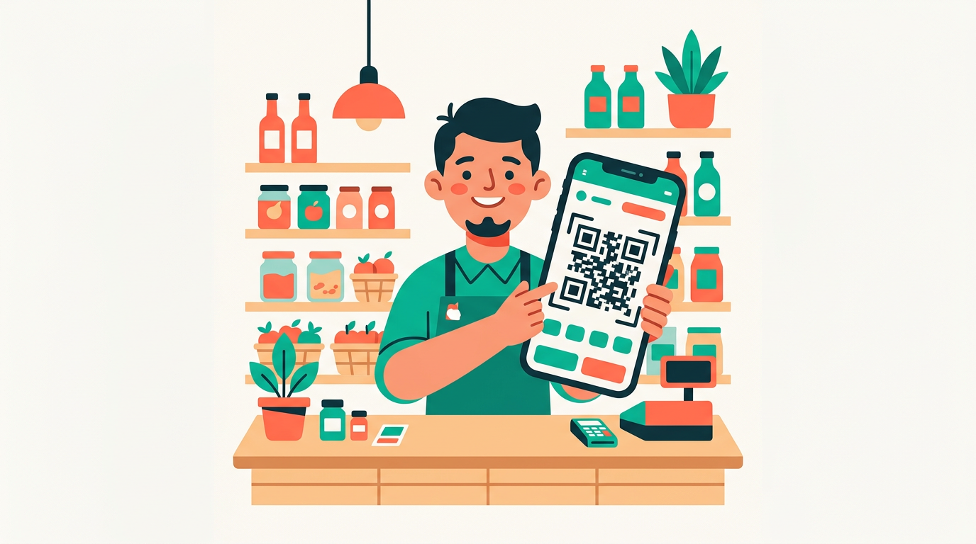
Here are twelve details we see matter in real flows, especially when the customer leaves your site or device to confirm in their bank:
- Amount + merchant identity up front
- One loud primary action
- Loading copy that matches reality
- Calm expiry
- Reference in plain sight
- Channel hints you actually mean
- Errors with a next step
- Success that closes the loop
- Tap targets + contrast
- Language match
- Logos only when they earn their place
- No fee surprises behind extra taps
1. Amount and merchant name above the fold
The total and who they are paying should be visible without scrolling. If the legal merchant name differs from the shop name, show both: friendly label first, official name smaller underneath. Mismatches here are a top reason people abandon before they scan or tap.
Try this: open your flow on a small phone next to a bright window. Can you still read the amount in one glance?
2. One obvious primary action
“Pay”, “Continue to bank”, “Open banking app”—pick one primary verb and style it clearly. Secondary actions (cancel, change method) should look secondary. Two equally loud buttons read as uncertainty.
3. Honest loading states
Prefer plain language tied to what is actually happening (“Creating secure session…”, “Waiting for confirmation…”) over decorative spinners that loop forever. If something can take ten to thirty seconds, say so. Predictable waits feel shorter than mysterious ones.
- “Connecting…” for under 300 ms → fine
- “Connecting…” for 20 s → feels broken
4. Visible expiry without alarm
If a session can time out, show a calm countdown and what happens at zero (“You can create a new payment from your cart”). Panic-red timers increase drop-off more than they prevent expiry.
5. Payment reference or purpose in plain text
For bank transfers and QR flows, the reference is how the customer recognises the payment in their app—and how you reconcile it later. Surface it on your confirmation path, not only in fine print.
Ops tip: support tickets often start with “I paid but…” — a visible reference on the thank-you screen cuts that volume sharply.
6. Channel hints that match reality
On mobile, assume one hand and a bright screen; on desktop, assume they may photograph a QR from the monitor or use a second device. Say what you expect (“Scan with your banking app”) only when it matches the flow you actually ship.
7. Errors that suggest a next step
Generic “Something went wrong” is a dead end. Pair errors with one recovery action: try again, use another bank, contact support with a short reference id. Log the id server-side; show the short id to the user.
| Weak | Stronger |
|---|---|
| Error | Payment could not start — try again or pay another way |
| — | Support code: Z-48291 |
8. Success that closes the loop
After confirmation, restate amount, merchant, and reference, and tell them what happens next (order status, email receipt, return to shop). If they already closed the tab, your email should repeat the same facts.
9. Tap targets and contrast
Treat the payment step like a form on a small screen: 44px is a good minimum touch target; don’t rely on hover-only affordances. WCAG-friendly contrast on the amount and primary button is not polish—it is conversion.
- Primary button: high contrast, full width on mobile when possible
- Secondary: outline or ghost style — visibly quieter
10. Language that matches the shop
If the storefront is German, the payment chrome should default to German unless the user switches. Mixed-language checkouts look accidental and reduce trust.
11. Bank logos only when they help
Logos can reassure (“my bank is there”) or add noise (twenty icons, none of them the user’s). If you cannot personalise, a short line (“Works with major German banking apps”) often beats a crowded strip.
Visual rhythm: alternate short paragraphs with lists, tables, or quotes so the page breathes — long columns of text feel slower than they are.
12. No surprises behind extra taps
If there is a fee or a surcharge, show it before the commitment step—not on a later interstitial. The same applies to delivery timelines if they affect the total. Surprises after intent are a reliable source of chargebacks on card rails; on instant bank flows they still cause support load and bad reviews.
Small improvements stack. You do not need a redesign—tighten copy, ordering, and honesty first. If you are shipping Zahlo’s widget or a hosted flow, use this list as a review pass before you point real customers at it.